For those of you unsure of what Discogs is, it’s a user-built music database and marketplace. Discogs is one of the largest and most comprehensive music database and market place with over 12.4 million recordings and 6.8 million artists. Discogs not only allows you to catalog and keep track of your own collection of music, but it also allows you to review and rate music releases, create want lists, and sell/purchase tapes, CDs, and Vinyl.
The Problem
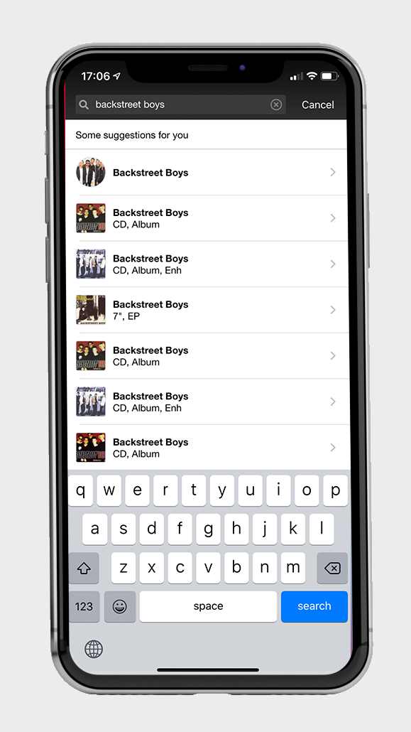
If you have ever used the app version of Discogs, you understand how difficult it is to find what you are looking for. Once you find the artist you are looking for, you have to scroll endlessly to find a specific album or release. This becomes even more of a problem when the artist you selected has been around for decades. To navigate around this, you can use the search bar to type in the name of the specific release but once you do that, you are presented with every single variant of that release that has ever existed.
The desktop version of this site does not have the same problems that the app does. It is extremely easy to navigate the search on the actual website due to the abundance of filters that are easily accessible from the beginning of your search. After selecting an artist, the default display is a list of their full length albums. The mobile app defaults to every single release ever published. This includes singles, compilations, mixes, videos, and full length albums.
The “Fix”
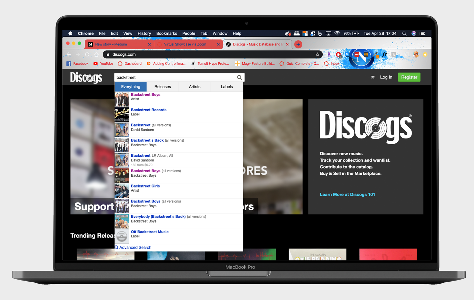
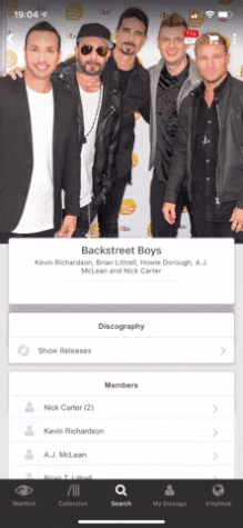
After comparing the mobile app and the website, I immediately knew what I wanted to do to fix the app. I knew I wanted the two to remain similar in how they function so I didn’t want to make and drastic changes to the app design or search functionality unless it was reflected on the website. I wanted to find a way to display the search features of the website, on the app. From this point moving forward, all examples will be searching for The Backstreet Boys because, I just want it that way.
1st Iteration and Testing
My initial idea was to just fix the main search functionality and not touch anything beyond that. When I use the app, I type in what I am searching for and wait for the search results to auto populate. Once I see what I am looking for, I select it from there. This is the first thing I wanted to fix. This search pulls up anything that matches your search word, so if I search The Backstreet Boys, I am presented with the Artist, but also their album of the same name. Not only will it pull up that album, but it will pull up multiple versions of that album, making it difficult to distinguish. This gets even more tricky when you are searching for an album or artist with a very common name.
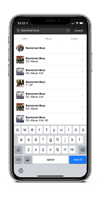
I fixed this by adding search filters underneath the search bar, just like you would see on the website. Due to space, I only added three filters- Artist, Album, and Single. Each one is a functioning search that will pull up related results, rather than everything imaginable. I left the defaulted search list to what it was originally because I can’t possibly know whether someone is searching for an artist or album and I wouldn’t want to display an artist if they are searching for an album. In the image to the left, you can see the new search filters at the top.
I thought that this was perfect, until I tested it. There was nothing wrong with the changes that I made. They were honestly a huge improvement. The problem was that not everyone searches this way. I thought I made this great change and it turns out that I was assuming everyone uses the app the same way I do. Like I described before, I search the app by typing in what I’m looking for and waiting for the results to auto-populate underneath. Half the people I tested this on dont actually do that. Instead, they will type what they are looking for, in this case it’s the Backstreet Boys, and then click the “search” button on the keyboard. By doing this they completely navigate around my fix. The page it takes them to is a much better version of the search results that display when you simply wait for the results to auto-populate. This page organizes the results by releases, artists, and labels. It’s extremely easy to find what you are looking for. This means I needed to start over.
2nd Iteration and Testing
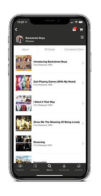
With my newfound knowledge in hand, I started out to further build out my Discogs search functionality fix. As you can see in the GIF below, once you get to an artists page, you have to scroll endlessly until you find what you are looking for. In this example, we are looking for the Millennium album. Since the Backstreet Boys had their first release in 1993, we have to scroll through almost 7 years of releases to find the album we are looking for. My goal is to fix this.
Similar to the main search, my fix involves adding filters to the top of the page. This will allow us to search by albums, songs, etc. If you recall the Discogs website from above, there are over 25 filters to search by on the left of the screen. This is obviously not feasible for an app. I decided to narrow it down to three main filters, just like the main search. For my filters I chose Albums, EPs, and Singles/others. The default results that will initially pull up is an unfiltered list of all releases.
Testing this was a little difficult. By the time we got to the second iteration phase of this project, we were on full quarantine mode due to the COVID-19 situation. My contact with others was extremely limited. Luckily I still had my wife to test on but I also thought that this would be a great opportunity to reach out to a friend that is an avid Discogs user. After explaining the scenario, he agreed that the current search functionality on the app was horrible. I had him first use the app to find the Backstreet Boys page, then the Millennium album. Then I had him use my prototype to do the same thing. The feedback I got from him was very positive. He loved the added filters at the top and felt that it made the overall app experience much more pleasant. From him, I was able to get some additional feedback to help in my third iteration.
3rd Iteration
By this time, I had received great feedback and had my design down to its final form. The design and layout of my prototype would stay the same. The only thing I needed to change was the filters. After the feedback I received and a little more research into the site, I decided to change the filters to match the website a little more. The three filters became Albums, EP/Single, and Compilation/Other. I felt this was a perfect finishing touch for my prototype. Not only did it add the ability to sort-by releases that may have been left out in my previous version, but it was a much better match to what the website already had in place. This makes for a more seamless experience between the app and the website. Below you can see some examples of what the new artist search looks like, you can also access my XD prototype by clicking on the box at the bottom of the article.


Conclusion
For a website with more than 20 million online visitors each month, you’d think they would have a more search friendly app. I feel like the solution that I came up with was simple, matches the sites branding, and resolves a much needed issue with the app experience. If you would like to click through the design, you can do so using the link below.
Due to the nature of XD, some features will be unavailable. You will be unable to scroll or type. This is simply a click-through of the design.